Showing posts with label Book of Bad Design. Show all posts

Saturday, 17 April 2021

WEEK 56 CORNOVIRUS: LEVEL 4 LOCKDOWN EASED - OUTDOORS SOCIALIZING POSSIBLE NOW

The bunting came out this week as we can now officially have 6 people from different households to visit as long as it is outside.  So Maggie and Brian came over with their bottle of NZ New Marlborough wine.  The sky was the bluest I've seen it in months!  We had a debate about this: is it because we have just come out of winter? Is is because restrictions are now starting to ease and it reflects (sorry for the pun...) our ache for freedom of movement? Is it because of the lattitude we live? It is to do with the nature or quality of the air, i.e. fresh, a certain level of humidity due to the climate?   In any event we sat in the back garden and just soaked it up as well as the ever-increasing heat of the afternoon sun.


The children of all ages go back to school on Monday - roll on the day!  They have been in a state of pseudo-hibernation for months.  To that end Ishbel and I went out for an 'inventure'... which means we don't quite know where we are going but will see what turns up.

We ended up at the Forth and Clyde Canal just east of Kirkintilloch.  I took these photos.


This is exactly how it appeared i.e. no Photoshoped adjustments. It is early afternoon facing east about 1 mile east of Kirkintilloch.

As we walked along the canal I was reminded of the above painting which is in the Burrell Collection. It is by a Scottish landscape artist:

The Last Turning, Winter, Moniaive by James Paterson (1854-1932). Painted in 1885, it depicts a woman walking along a riverbank towards the village of Moniaive in Dumfriesshire.  

[Burrell Collection Photo Library]

* * * * * * * * * ANOTHER CANDIDATE FOR THE BOOK OF BAD DESIGN ** * * * * * * * 

Ishbel and I are aching for the Braehead Mall to open which means a trip to Waterstones and then a pizza at Cafe Nero.

She reads avidly; I less so.  That being said recently I have enjoyed 3 Alexander McCall-Smith books I picked up in Tesco's in their Take One-Leave One bookshelf opposite the checkout.


Last month I heard one 15 minute episode of the above book called The Snow and the Works on the Northen Line on Radio 4.  It is by Ruth Thomas and published by Sandstone Press of Inverness with the publication date of 2021.  Editor: Moira Forsyth.

I was reading it in bed and found two things: I can't recognise the story ... very odd... but leave that aside just now....and secondly, I  just couldn't get the book open enough to read the text on the inner left side. Huh?  What's all that about?  I have just about had my fill of books with typos, poor grammar which,  on my most recent experience, was a self-published or should I say 'hybrid' book.  But this book had a cover which was not cheap and the type was clear; certainly no typos. Paper quality - not CheapO.

I looked up the printing details: 'Typeset by Biblichor Ltd, Edinburgh' and 'Printed in Poland'.  Well, somebody, somewhere has done something amiss here. And the book cost £8.99..... The photo shows an outside margin of 5/8 inch on left and right pages.  The inner margins are 1/4 inch. 

I am going to have to add it to my list of Bad Design which is so often about really basic stuff either missing or badly done.  Yawn....


Thursday, 6 July 2017

SUMMER SNATCHES

The summer days continue with a variation of grey sky and no rain to grey sky with rain.  Occasionally the sun comes out so it is a matter of grabbing 'summer' in snatches.

Everything is growing a lot.  In 'snatches' I manage to keep on top of the jobs - quite satisfying.  I also notice that the soil is improving now that a few years have gone by.  

 
The roses in particular have been big, blousey and abundant.  They are in a sunny corner and have stood up well so far.

Here is a photo of the orchid that appeared in Anne's garden.  I've made several attempts to photograph it but each time the breeze gets up or the sun goes behind a cloud.  I never realized it was so difficult!


Another summer snatch: the day declared itself - steady rain.  I got out the jars and filled them with beet and apple chutney.  Maggie's recipe.


Having burned my potholder on the gas hob I found this funky oven glove in the Oxfam shop.  Harriet will love it.  She's always keen to make something so this will be one for her on our next baking session. 

 * * * * * * * * *
Another candidate for inclusion in my 'Book of Bad Design'  - DYMO KITCHEN SCALES


These are my kitchen scales.  I had to move over to digital as I couldn't find any old fashioned ones (that were robust) when wishing to replace my old weighing scales.

The scales measure in both metric (grams) and avoirdupois (ounces and pounds).  I regularly use both so am always having to change.  The problem with the design of these scales is that it is almost impossible to see the 'unit of measurement' text  (OZ  or GM)  in the upper right hand corner of the screen.


What I do is take the scales to a strong light and tip it so I can read the OZ  or the GM text in the upper right corner.  To change is easy; punch the kg/lb button which operates as a toggle switch.


Saturday, 30 July 2016

GRANDMA GOES SHOPPING

Time and fashion have passed me by. Somewhere along the line I have missed out on high street trends in clothing.  Maybe it is because when I shop I observe that most of the clothes are the style and size for 12 year olds, e.g. hipster trousers, blouses that leave half the midriff showing.
 
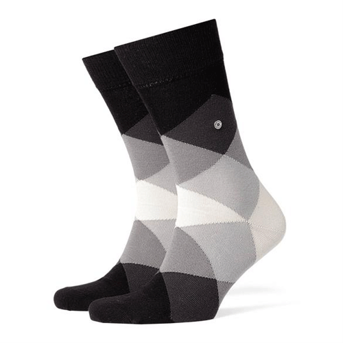
Be that as it may, I bought these socks recently at The House of Bruar in Perthshire.  I always thought this was a one-stop shopping 'experience' for the mature individual looking for quality cord trousers (men) and button-up cotton shirts for women ... something you might wear to the office.

They also carry Austrian and German brands which, needless to say, are Quality with a capital Q.


Well, I bought these socks (above) , Burlington brand, made in Germany. When I got home I took the card tag off by cutting the thread which was stitched in 2 places to one of the socks.  (At least it wasn't stapled.)

I then noticed that there was a stud located mid-sock ... I would call it a 'rivet' because it has a metal back to match its metal front. As shown in the photo above, it is about the size of the end of a pencil.

For the life of me I couldn't get it off.  If I used scissors it would only make a hole in it.
Before I phoned The House of Bruar to ask how I would get this bit of packaging off I decided to google the brand.  

Yes... you guessed it ... it is meant to be there! It is called a 'clip'!  Nowadays we not only have ironmongery in people's noses and every other part of the human anatomy but we also have them skewered into ... the humble sock!


Monday, 23 May 2016

POSTAL VOTE EAST DUNBARTONSHIRE CORRECT WEBSITE ADDRESS

Polling Day for the UK Referendum on the United Kingdom's Membership of the Europen Union is June 23.

The option to vote by post is suitably in place ... that is, if you can read the reference on the back of the Polling Card.

Having spent a great deal of time working with text I guess I am a bit twitchy about things like grammar and clarity ... or maybe it is failing eyesight ... but here is another item for my Book of Bad Design.

Here is the text on the back of the Polling Card:


The address is   www.dab-vjb.gov.uk

Monday, 6 January 2014

BLUE MONDAY

I have not had a good day.

I was at the garage mid-morning to see about a small prang on the wing mirror of my car, a Volkswagan.  I clipped it on the garage door at the weekend.  Alan fixed it by popping the cover back on again and as I was driving off, Mairi drove in to leave her car with Alan.

I magnanimously offered to drove her back home after she collected Harriet from the Nursery.

Well, as I pulled into the car park at the Nursery I drove over the edge of the parking area and on to loose stones laid of soft earth.  I got well and truly stuck.  (Note to myself: add this to my Book of Bad Design, i.e. no raised edge, barrier or traffic cones at edge of parking area.)

Nothing for it but phone Iain to come and pull me out.  I even had a robust tow-rope in the boot (trunk).  He phoned to say he couldn't get his car to start - clutch trouble.


So I called the AA and, eventually, the nice man arrived and pulled me back on to the tarmac. So it was a bit of a wasted day for both Mairi and I except that while we waited Mairi sorted out a problem I had with not getting a ring tone or vibration on my iPhone.  I guess when the software was updated recently the default position was OFF and I never thought to check it out in Settings to take it off that position.

We headed home to Mairi's house where John was just in having collected the children from school.  He had a pot of tea and hot, buttered toast waiting.  Heaven!


Meanwhile here is a nice photo of the two of them as we sat in the foyer waiting for the AA man to arrive.


PS.  All's well that end's well: no damage done and no cost incurred.


Saturday, 16 November 2013

ARCADIA STRING QUARTET - ARTWORK NEEDS TO BE REDESIGNED

Playing in Cairns Church at the Milngavie Music Club, Milngavie (Glasgow) last night were a wonderful quartet from Romania. They are currently on tour in the UK.  Their website is here.

I bought their CD at the end of their quite wonderful concert of chamber music: Beethoven, Janáček and Debussy. (This is my scan of it.)


It was like hearing music played from another era where graciousness and elegance were evident in the chambers and salons of the patrons of the arts.  They played beautifully (winners of recent competitions so it stands to reason), and looked beautiful as they smiled, and established eye contact for starts and pauses. Being a young group they brought verve and pizzazz to their playing while being polished and restrained at the same time. They come from a culture that values music and it shows... e.g. all school children learn about their country's music from an early age.

The first violinist, Ana Törö, wore a garnet red gown which highlighted her figure, skin tones, hair colouring and instrument in the soft light of the church.  The men wore black with garnet red bow ties.  As a group they were a joy both to the eye and the ear.

Flowers were at the front and candles were lit at the side of the church which is carpeted in red with red chairs (the pews having been taken out to make the space more versitile.)

So why am I going on about them in this way?  Because I feel they are being very badly served by their marketing people. Their website shows photos taken of them in some grungy location on a wet day.  In all of the photoshoots these 4 talented people are wearing .... it does them no justice.  Is this supposed to be art? Sophisticiation?

To help things along I have taken the liberty of doctoring the CD cover image.    


I have used a photo of flowers that were in the church (about a month ago) which were on on display in the same  location as they played last night.  At least this latest CD cover  has something other than a disused factory, thankfully, but it's only a slight improvement in that they look totally washed out ... which they certainly are not!


Photoshop to the rescue!  

 I rest my case...

Thursday, 19 September 2013

BOOK OF BAD DESIGN: BAXTERS PRODUCT

What is this? There is no word on the container nor the price label to tell you.  This is basic information and it is simply not there.


Eventually I found what they are selling.  Around the back in small print heading the list of ingredients was the word "soup".


(Next time I buy soap powder for the washing machine I must remember to take a photo; it is another example of this most basic form of communication.)


Saturday, 13 July 2013

BOOK OF BAD DESIGN: JUICE SOUND SQUARE PACKAGING

As I am trying to drag myself into the 21st century (in terms of technology) I sometimes make a whim purchase.  When in Glagow's John Lewis's the other day I bought this mobile phone and iPad accessory: a Juice Sound Square made by Gusto.  Their website is here; appear to be based in Coventry, UK.


The cube is a speaker which allows "playback of music anywhere, without the need for a mains connection. This portable speaker can connect with any Bluetooth® device wirelessly, or wired to anything with a 3.5mm headphone jack to boost sound quality. With battery life up to six hours when using Bluetooth®, and up to ten hours with line-in....". 


Nice bit of kit!  Just try opening the package.  It took me ages to figure out that the clear plastic case was a slid-out arrangement.   Ah! It's got clear tape at the top ...


And this side ...

 And that one ...


 And the base ...


 And slide .... What was all the fuss about?!


If they are so ethically minded, and they make such elegant accessories, (complete with cord and wee bag) not forgetting the instruction leaflet which is good ... why not make a simple package? How about some origami sort of thing that simply unfolds?


Thursday, 4 July 2013

JAR LID SOLUTION

Is it old age and decrepitude or are jars getting harder to open these days?

 
Never mind plastic tubs whose seal won't tear up or sideways or even off all at once or even in bits ...  and cartons that defy my efforts to tear them open, it is plain old jars that are factory sealed to withstand fire, hurricane and earthquake.  Why else would they take a trip to the workshop vice to get the thing to unpop and screw off successfully?  (And there wasn't 3 layers of packaging to get to this stage either!)


Wednesday, 14 November 2012

BOOK OF BAD DESIGN CONTINUED

While there is much good design about, there is also a lot of bad.  Furthermore there is bad design produced by ?people/companies?/brands? that pride themselves in good design.

These are my current offerings simply because they are of a size and scale that can be photographed.  (Some day, sometime, will someone please photograph department store layout (e.g. IKEA), traffic lanes and pedestrian walkways that leave one shaking in fright or despair!)

[1]  The container for V8 Vegetable Juice Original.  Back of box states "Campbell Foods, Belgium".


Look at the foil disc that stays as a flap at the opening once the green cap is (with great effort) screwed off .... a perfect medium for germs.


[2]  The plastic container for Ocusan eye drops.  The plastic is so thick/stiff that, even using 2 hands to squeeze out the watery liquid (while trying to aim the drops correctly), I usually end up abandoning the effort.


 [3]  Leather watch strap with buckle.  The top photo shows how it sits on my arm.  The straps are sufficiently unequal to make the topside clock face and the buckle sit weighted to each side. I have tried putting an elastic band on one side to keep it from sliding around... about 40% successful, i.e. it stops it sliding completely out of sight!


 [4] Espresso Coffee Machines.  No, it is not the noise of them that rates an entry here, it is the milk heating jet and the practice of cleaning it (or not).   Next time you stand at a counter waiting for your espresso look at the way the equipment is laid out and used.  When they go to make you latte or whatever, they take the cup up to the milk jet (white arrow) and the  jet heats everything up (or whatever it does).  When the cup is taken away, the dripping metal jet is either left as is or wiped with a cloth*.

In this photo, from Wikipedia, it actually has a wine coloured cloth hanging on a hook (blue arrow).  Milk is one of the best media for growing germs; cloth or no cloth - this design guarantees it.

* Watch how it is usually a J-cloth and it's the one that is used to wipe the spills on the counter or trays ... you get my drift!


Monday, 15 November 2010

BOOK OF BAD DESIGN - CHILDRENS' CUPS

Off and on I come across examples of either products or processes that are, in my opinion, badly designed. Whether it is traffic flow, exits from buildings, coffee cups or equipment, I try to come to terms with my frustration by consigning them to a place in my head: "There is another candidate for My Book of Bad Design".

Before I go any further I must point out that I do have a matching (smaller) fanciful book-in-the-making: My Book of Good Design but, frankly, I don't see it ever seeing the light of day simply for lack of material.

So today is the day I have decided to try and pull some of this together. From time to time I will make posts of such items, processes or systems as a way of cataloging them all.

My first submission relates to childrens' drinking cups. The pink and blue ones in the foreground are ones I bought in Helensburgh last year and they are terrible for spilling. They were not cheap; the stack in the background are IKEA's. However the design problem is the same - they are unstable.

My husband who is a structural engineer tells me that for stability the base of the cup should be as big as possible and the centre of gravity should be as low as possible. Tapering the sides of the cup inwards from top to bottom violates 2 basic principles of stability:

[1] The base should be as wide as possible
[2] The centre of gravity should be as low as possible.

The tapered shape should be banned by the Health and Safety Executive, so he says!

Needless to say, the next time you spill a mug of coffee, look at its shape!